
Creating Comic Characters: A Primer
 " . . . Oh dear God, it's a Mary Sue."
Sometime yesterday after 1:00 PM I said these words, upon the realization that a new character of mine (whose details I won't get into right now if only because one, it'll ruin the suspense, and two, if I actually SAY anything about Character X it'll be taken as the Word of God) was just . . . built up too much. Safe to say, Character X is being rebuilt as we speak.
Creating characters may be one thing -- and the details of which are covered in so many other tutorials online -- that it's worth detailing how a comic character differs from, say, a character you might come up for a written story of yours, or a role-playing game. The differences?
- Ease of Illustration - If you plan on drawing this character over and over (and OVER) again, it ought to be something that is easily-enough drawn if you expect to be able to keep drawing at a particular speed. Granted, the more you draw a character the easier it gets, but it's still a problem if your character happens to have several features that are not easily drawn -- elaborate masks and tattoos, large wings... if it take too long to draw, you've got a problem.
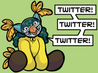
- Visual Originality - Okay, great backstory aside, how do they LOOK? A common sin of most video games who think just altering the faces of their characters is originality enough, the easiest way to check if you're doing it right is the silhouette test. If your bodies are too similar or the hairstyles are too confusing, this will highlight most problems. If you don't do this, you get posters like this one where the only reason I can tell one blonde from another is by the clothes. And even that doesn't get me too far.
 (Yes, Adam Hughes, I know it's not your fault you get stuck with trying to make DC's intellectual properties look unique, but come on, man . . .)
- Visual Appeal - This should NOT be confused with sex appeal lest you draw all your women with the exact same size breasts. Visual Appeal, rather, focuses on the aesthetics of drawing the character; regardless of how attractive or "disgusting" a character is intended to be, they should still have a general degree of characterization that makes the character appealing somehow. A good example of "ugly" creatures with great visual appeal are the movie-monster archtypes; the mummy and Frankenstein's monster might not be the type of creature you want to run into in a dark alleyway, but they still retain a certain level of charm about them.
- Not remembering that a character should be easy to draw will only slow down your ability to draw pages, leading to burnout.
- Not designing visually unique characters means that readers will confuse them for each other way too often. (In recent pages, for example, Nate and Vince have been getting confused for each other -- familial relations aside, it's a sign that I need to tweak them a little further to prevent future issues.)
- Not designing characters with a certain visual appeal in mind means that readers don't get the characters at all... and thus your efforts end up in vain.
Labels: characters, comic tricks, content, creativity, design, visual storytelling
posted by Rachel Keslensky @ 2:23 PM
5 Comments
![]()
![]()


5 Comments:
From an artistic standpoint I think that’s pretty much dead on. But since you asked…*laughs*
One of the things that has always bugged me in the reading of webcomics and comics (and for any matter any story driven thing). Is that the world is limited to the little window you see, and beyond that boundary nothing really exists. I love the characters that have the sensation that they truly do exist beyond the page, and that they did exist before “we” met them for the first time. To have an artist actually work to create a fully fleshed out universe rather than the two-dimensional framework, (no pun intended) takes a far bit more dedication than a simple “Let’s make this charrie like this”.
It’s something I’ve rather enjoyed here, since there is such a sensation of life in the universe beyond the one’s we’ve met here. (or death in the cases of a few.)
It takes a lot to make a universe, lots of planning and plotting, and it definitely shows how much you respect the readers out there when showing it off a bit.
Anything that prevents comic myopia can only be a good thing.
On the other hand, there is such a thing as going overboard; it's the difference that separates a well-crafted world from Tolkien-induced boredom. That said, I doubt I'll get a chance with a comic like this to hit that stage, since the main difference is how much about the world gets explicitly mentioned. As opposed to, say, reference pages added to the site later. (Mwahaha)
Oh yes this much is true. *laughs* You can always go to the other extreme. Making so many nit pickings and rules that it’s about the details rather than the fun. Balance is a wonderful thing!
Gah, I hate it when that happens. I've had to rebuild a character so much because of that.
But sometimes people looking similar can add to a story, so long as it's done well. You'll get people who'll argue that it's never written well, but I disagree.
Similarity depends on the plot elements involved; evil twins come to mind, but for the most part, it helps to keep characters looking at least a little different from each other.
In Nate / Vince's case, I could do with a little more difference anyway.
Post a Comment
Subscribe to Post Comments [Atom]
<< Home